


1926 London Underground Enamel Platform Sign - Trinity Road (Tooting Bec)
Trinity Road (Tooting Bec)
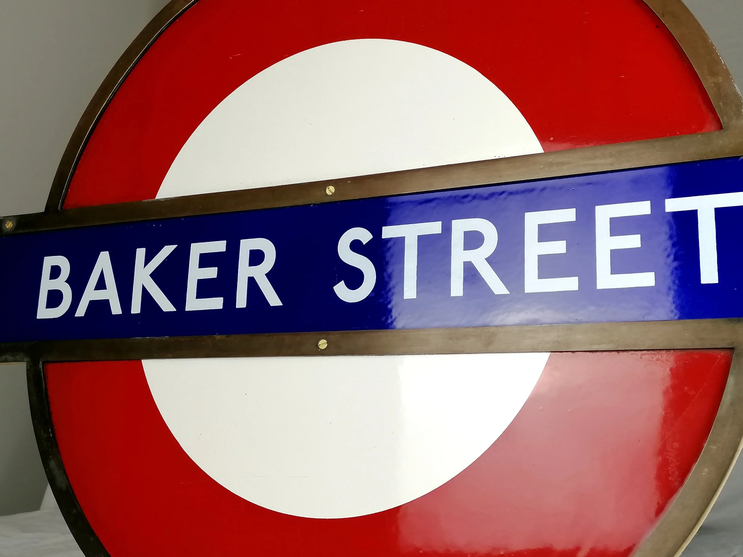
Vitreous enamel on two panels of rolled iron. Produced for the Underground Group. Installed upon opening in 1926. Registered design “No. 659814”. Measures approximately 5ft (W) x 6ft (L). Lovely in-situ condition. Many mounting holes and marks. This sign would have had a blue wood frame around the station name and there are paint marks and holes where this used to be.
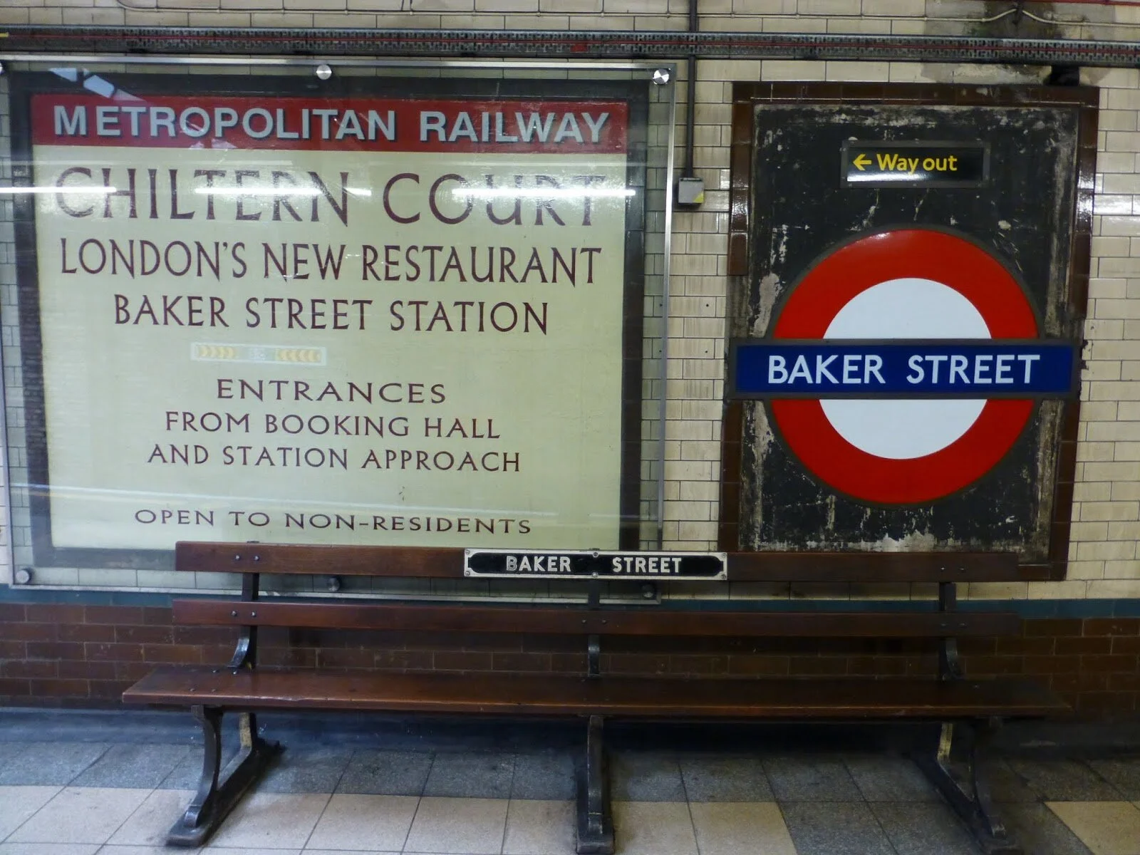
Trinity Road (Tooting Bec) was opened in 1926 as part of the extension of the City and South London Railway (now part of the Northern Line) from Clapham to Morden. This stunning and extremely rare platform roundel was originally displayed on the curved platform wall. This style of sign is still present at the other Morden-extension stations such as Balham (see photos).
It is likely that this sign was removed around 1950 when the name of the station changed to "Tooting Bec".
This sign features one of the earliest uses of the 'Johnston ring' (registered design 659814). The Underground Group commissioned Edward Johnston to design a new, modern typeface for the London Underground which was slowly introduced from 1916 and an updated version (New Johnston) is still used today. A few years later, Edward Johnston combined his typeface with the red ring - and so the 'Johnston ring', one of the most enduring an recognisable logos in the world, was born. Whilst this was first seen on maps from 1919, it wasn't until 1923 that it was used for station name signage ( for the Golders Green to Edgware extension stations).
Another interesting fact about this sign; The arrow design in the "Way Out" box was designed by a young Harry Beck, the creator of the iconic London Underground diagram. In his personal scrapbook held by the LT Museum, he has a copy of this design with a note below staying "one of my first drawings as a junior draftsman in the Signal Engineer's Office".
Although curved (due to its original position on the tube wall) this sign does flatten with a bit of pressure and would mount flat on a wall. The lower panel has a recess along its top edge for the upper piece to sit neatly into.
This would look outstanding as a feature in a large kitchen, hallway or garden - Particularly if you live in South London!
These two panels are large (6ft x 2.5ft each) and made of rolled iron so are quite heavy. Collection only. For UK buyers, I can recommend reputable carrier who does some work for me and my friends from time to time.
Trinity Road (Tooting Bec)
Vitreous enamel on two panels of rolled iron. Produced for the Underground Group. Installed upon opening in 1926. Registered design “No. 659814”. Measures approximately 5ft (W) x 6ft (L). Lovely in-situ condition. Many mounting holes and marks. This sign would have had a blue wood frame around the station name and there are paint marks and holes where this used to be.
Trinity Road (Tooting Bec) was opened in 1926 as part of the extension of the City and South London Railway (now part of the Northern Line) from Clapham to Morden. This stunning and extremely rare platform roundel was originally displayed on the curved platform wall. This style of sign is still present at the other Morden-extension stations such as Balham (see photos).
It is likely that this sign was removed around 1950 when the name of the station changed to "Tooting Bec".
This sign features one of the earliest uses of the 'Johnston ring' (registered design 659814). The Underground Group commissioned Edward Johnston to design a new, modern typeface for the London Underground which was slowly introduced from 1916 and an updated version (New Johnston) is still used today. A few years later, Edward Johnston combined his typeface with the red ring - and so the 'Johnston ring', one of the most enduring an recognisable logos in the world, was born. Whilst this was first seen on maps from 1919, it wasn't until 1923 that it was used for station name signage ( for the Golders Green to Edgware extension stations).
Another interesting fact about this sign; The arrow design in the "Way Out" box was designed by a young Harry Beck, the creator of the iconic London Underground diagram. In his personal scrapbook held by the LT Museum, he has a copy of this design with a note below staying "one of my first drawings as a junior draftsman in the Signal Engineer's Office".
Although curved (due to its original position on the tube wall) this sign does flatten with a bit of pressure and would mount flat on a wall. The lower panel has a recess along its top edge for the upper piece to sit neatly into.
This would look outstanding as a feature in a large kitchen, hallway or garden - Particularly if you live in South London!
These two panels are large (6ft x 2.5ft each) and made of rolled iron so are quite heavy. Collection only. For UK buyers, I can recommend reputable carrier who does some work for me and my friends from time to time.