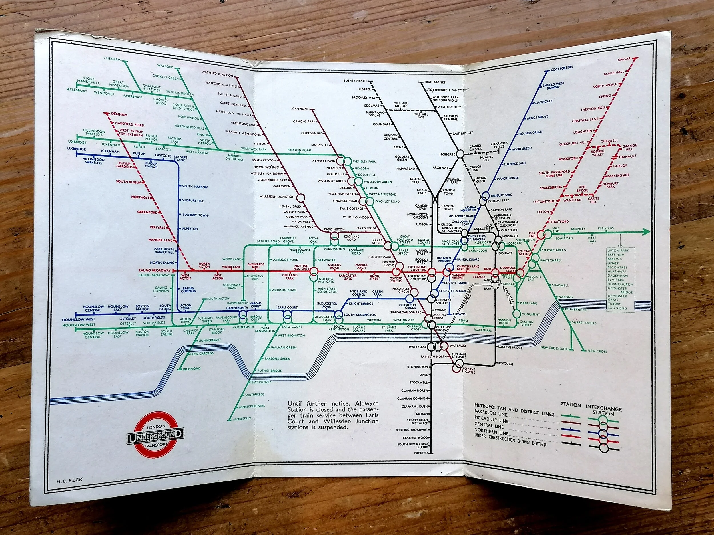
1912 London Underground Pocket Map - 'Central London (Tube) Railway'
“Central London (Tube) Railway ‘The Direct Line - Trains Run Every Few Minutes’ (March 1912)
Printed by Johnson Riddle & Co Ltd for Central London Railway. Folding paper map, Measuring 26.7cm (W) x 21.2cm (H), Dated March 1912. No Print Code. Information and a smaller map on the verso. Condition: Outstanding, near mint condition.
This exceptionally rare and colourful map is an unusual edition issued by the Central London Railway in the year it extended to Liverpool Street. Whilst it resembles the first Underground maps of 1908/1909 it is in fact a completely redrawn design. The designer introduces colour to the background detail, showing parks as green and roads as white on a green backdrop. The railway lines have been smoothed out for a cleaner appearance and the border, rather the signature green of the regular Underground maps of the day, is brown. The title makes reference to ‘Tube’ which the CLR leveraged heavily in their early marketing campaigns, naming itself the ‘Tu’penny Tube’ on account of its single fare of 2d to any station.
Most notable however is the change of designated colours for each line which not only differ from the official Underground map of 1911/12 but the comical boldness of the red CLR line leaves the viewer in no doubt who issued the map!
In 1908, the first all-inclusive map design of the London Underground was approved and the companies agreed to operate under a single ‘UndergrounD brand. The streamlining of station signage, posters and publicity were all coordinated immediately. However, even after 1908, a few railway companies (CLR and the Metropolitan in particular) continued to promote their own interests under their respective brands.
- Price does NOT include delivery.
- Delivery/collection must be purchased/organised separate to product purchase.
- Please ensure you have read and agree to the conditions within our Returns Policy (link at bottom of page)
- Please use the Enquiry Form below to request a delivery estimate, if required.
Enquire about this item


